When patients visit doctors’ offices, it’s normal for them to feel uncertain, anxious or nervous. Choosing an interior color palette that evokes positive emotions can help ease their mind, lift their spirits and improve their overall experience.
Understanding color psychology can help you determine how to choose an office color theme for a medical practice. Explore color theory for medical spaces in this article!
Color theory is a concept that visual artists and designers use to help them define colors, mix colors and come up with effective color schemes.
The main tool that helps them understand these relationships is the color wheel, which has largely been attributed to Sir Isaac Newton. While studying white light that reflected off prisms, he discovered it created a spectrum of colors indicating a shared harmonious relationship.
Today, designers and artists continue to use the color wheel as a basis for color theory, using color relationships to create a proper foundation and framework for their designs. They use specific rules, definitions and guidelines — like primary, secondary and tertiary colors — to communicate with viewers and mix colors effectively.
Color theory applies to a range of artistic fields, including interior design, painting, photography, branding and advertising, beauty and fashion, industrial design and many others.
What emotion do you feel when you enter a particular space? Maybe you experience a sense of peace and relaxation or a burst of energy to help you take on the day. On the other hand, perhaps you detect a sense of tension or uneasiness that makes you want to escape your surroundings.
Interior design sets the mood and atmosphere of a room. Color is one of the integral components that help create this tone — this is known as room color psychology. Interior designers carefully and strategically choose hues to invoke a certain emotional response and mood. Research into color theory has attributed specific emotions to each hue, also taking other factors like saturation, tint and tone into account.
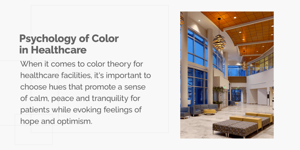
When it comes to color theory for healthcare facilities, it’s important to choose hues that promote a sense of calm, peace and tranquility for patients while evoking feelings of hope and optimism. With that in mind, below are some basic color choices and their commonly associated feelings and emotions.
In color psychology, red has a wide range of associations — danger, excitement and energy, aggression, passion and love, to name a few. It can be an incredibly versatile color, whether you’re going for bright and energetic or dark and powerful. However, too much red in a healthcare facility may be daunting or overwhelming for patients based on these associations.
Orange is often associated with optimism, creativity, vibrancy and motivation during trying times. This may invoke feelings of positivity, health and vitality in patients.
A muted shade of orange tends to be more earthy, inviting and less glaring than red, making it a friendlier choice for healthcare facilities. On the contrary, a dark or burnt orange can be associated with tension, aggression, pride and greed.
Yellow promotes feelings of happiness, optimism and energy. When using yellow for a medical facility, you need to ensure it fits your office personality. For instance:
Yellow can be a great choice when used effectively. However, like other warm colors such as orange and red, you need to be careful with bright yellows so as not to overwhelm the viewer.
Green is often described as refreshing, tranquil, healing and stress-relieving, which is why you’ll often find it in the décor of medical facilities. Industries like healthcare and food production typically use this color to promote a healthier lifestyle.
Bright shades of green represent spring and rebirth, while a muted olive evokes feelings of earthiness, elegance and nature. However, you want to be careful with darker greens as they can represent greed, money and materialism. Furthermore, a yellowish green may evoke feelings of illness, decay or envy.
From scrubs to health-related logos to waiting room chairs, blue is a popular choice in the medical world. Blue color psychology suggests most shades will give your medical office the desired effect.
Blue is a soothing color that evokes feelings of peace and serenity, which can help ease worries for patients. Lighter shades of blue are refreshing like a spring breeze, while darker blues can be strong and dependable. Nearly all blues impart a sense of trust, which is essential for doctor-patient interaction. Just be careful not to use too much blue, as it may evoke feelings of sadness or aloofness.
Purple can take on varying attributes depending on the hue. Darker shades of purple are generally associated with royalty, luxury and wealth. However, they can also evoke feelings of sadness and frustration. On the other hand, lighter shades are known for romantic and light-hearted energies.
Like blue and green, purple can be a calming color for patients when in cool muted tones. It’s a great choice for waiting areas, wards, hospital rooms and wellness centers like spas.
White symbolizes innocence, purity and peace, which can help patients feel more at ease. This color can work well for medical offices as it feels sterile and clean. However, too much white can feel cold and isolating, so be sure to incorporate decorative elements like artwork, plants or a fish tank.
Brown is often associated with feelings of comfort, strength, reliability and security. A warm, welcoming color that can help put patients at ease, brown can be a great choice for medical and dental office interiors. It’s also a versatile hue with a large selection of shades and tones, meaning it can mix and match well with many furniture finishes and styles.
Just be careful not to use too much brown — large quantities can make the space seem stark, vast and empty, potentially causing feelings of loneliness and isolation.
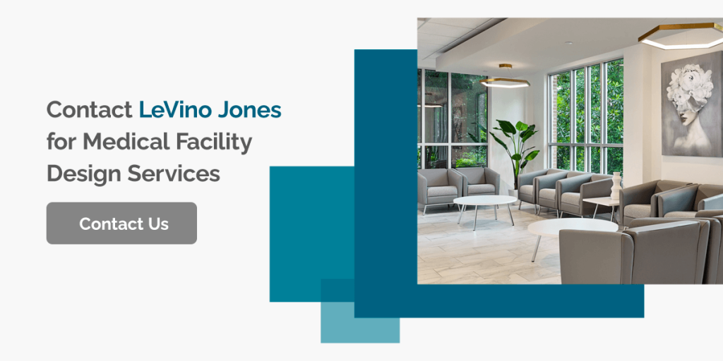
At LeVino Jones, transforming medical spaces to improve staff and patient experience is our specialty. Whether you’re moving to a new location or revamping your current building, our comprehensive design services can assist the entire process, from space planning to construction to completion and refinement.
With over 30 years of experience in designing various healthcare spaces, including medical offices, pharmacies, dental offices and more, you can count on us to create a functional and aesthetically pleasing space for maximized flow. Feel free to check out our testimonials and portfolio for an idea of what we can bring to your space.
Get exceptional and specialized interior design consulting for your medical facility with LeVino Jones. Contact us to book a consultation and learn more about our services!